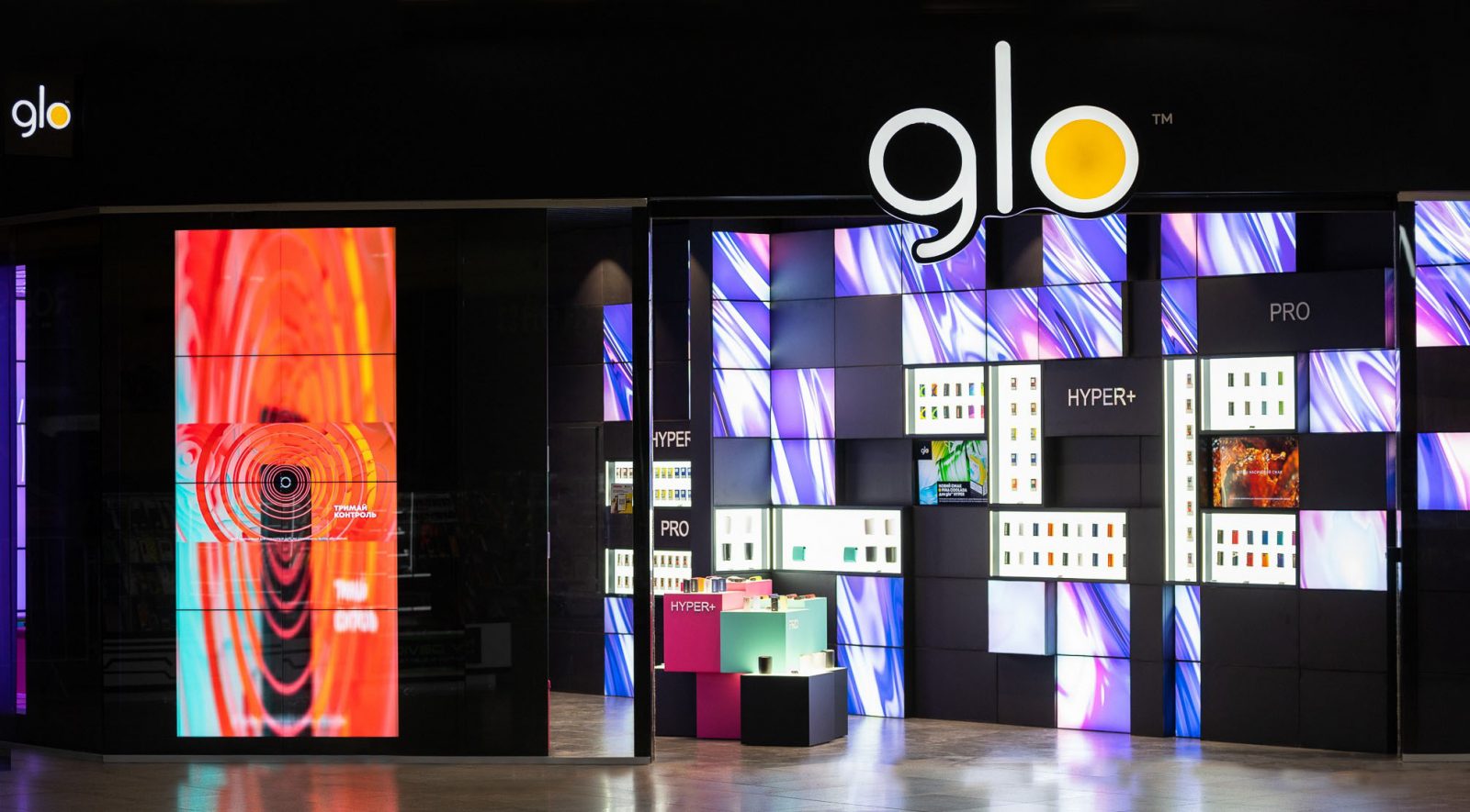
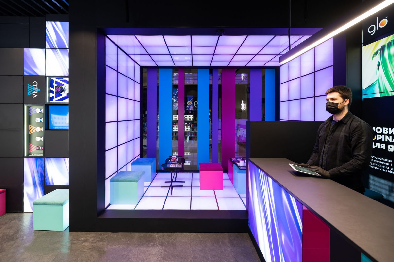
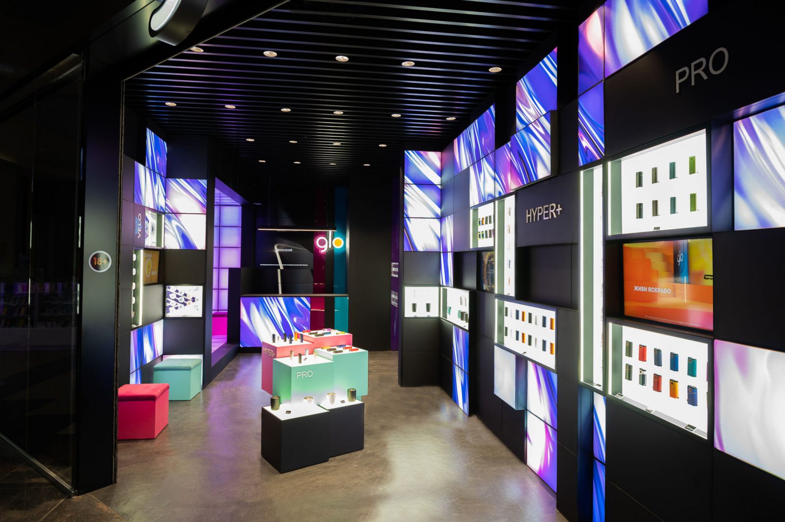
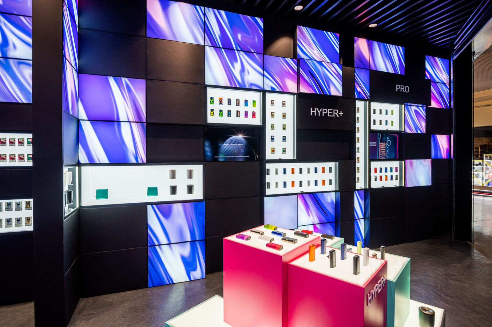
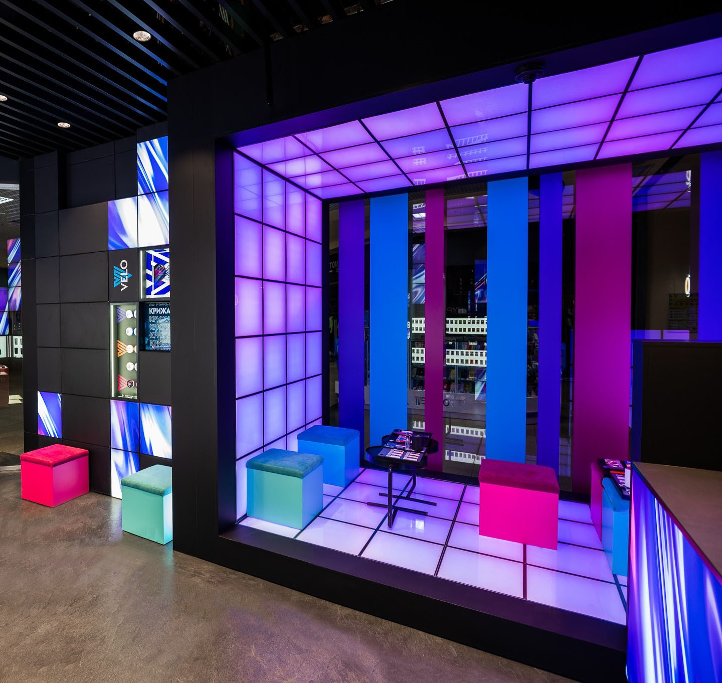
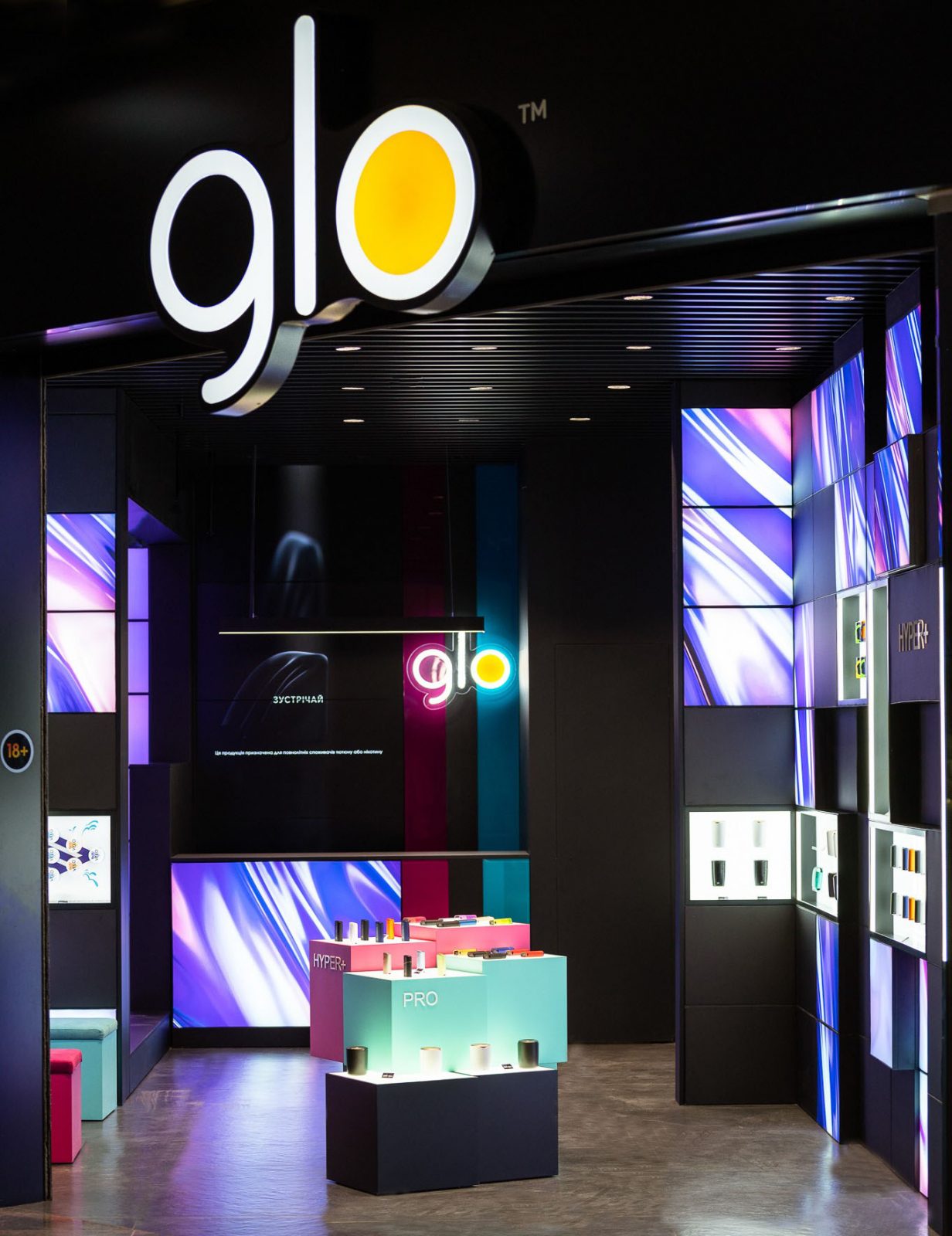
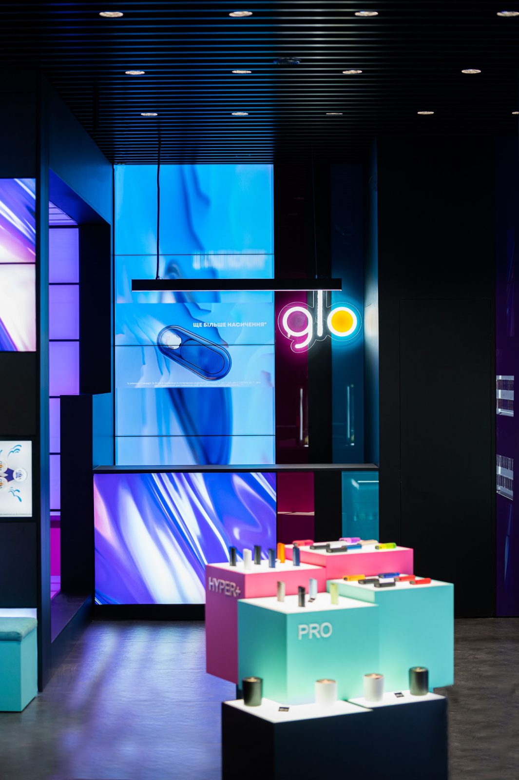
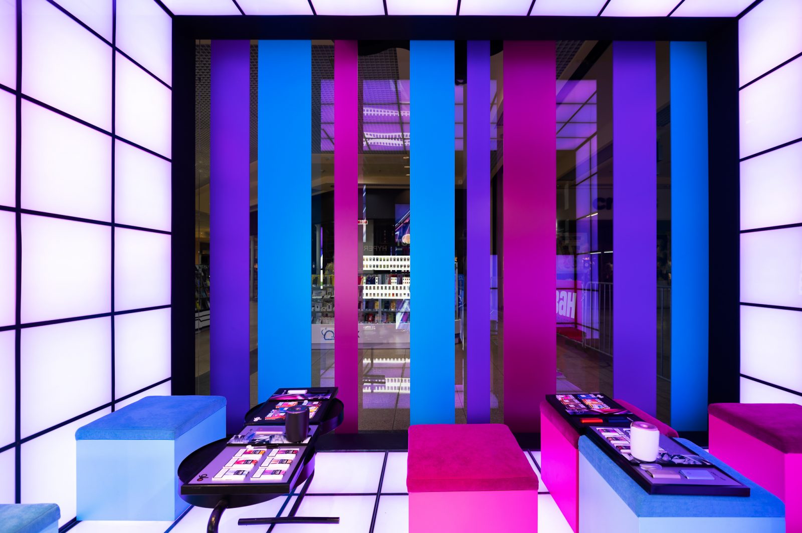
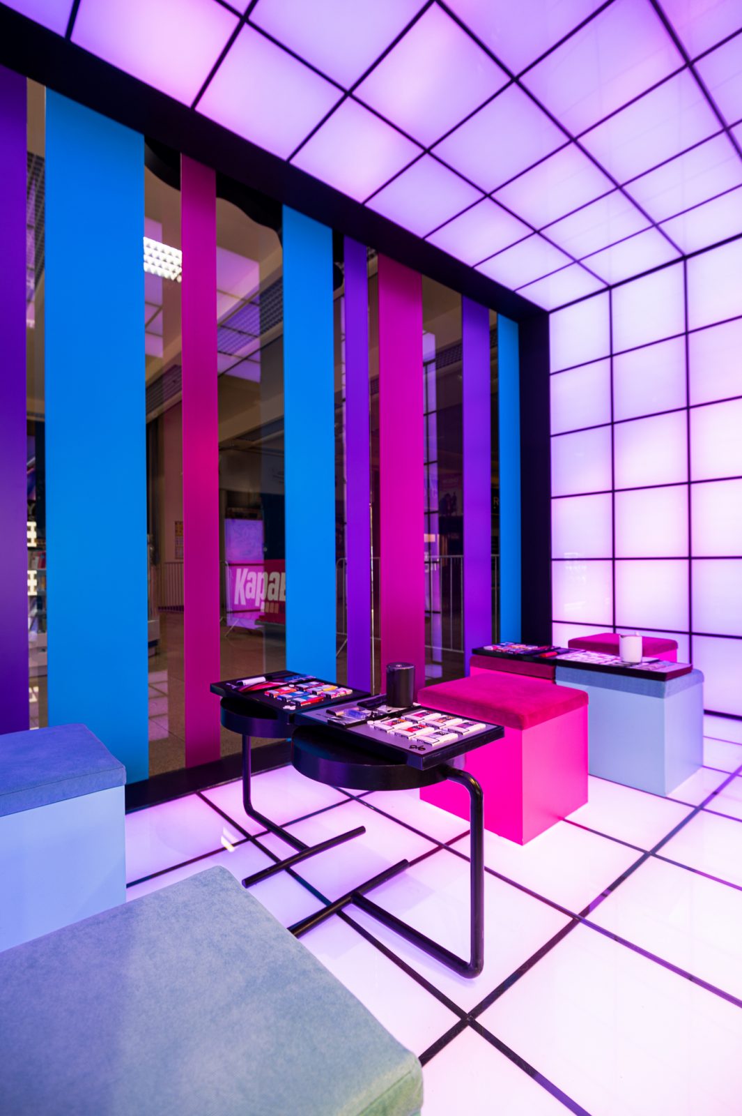
In this project, the ZIKZAK Architects team managed to combine the functional logistics of the retail space in the Karavan shopping and entertainment center with the style of the innovative glo brand.
glo

What is the “trick” of the project for the glo brand: we managed to turn the brand philosophy, stylish bright design and interactive consumer journey into an applied volumetric space.

On 41 m², together with contractors, ZIKZAK Architects created a tangible world of intangible sensations, materialized anticipation, embodied impersonal fantasy.

Everyone in their own way perceives the offline world of glo, invented by us and has no analogues. This is where the virtual representation of the product comes to life. Showcases with goods, personal feeling and communication with a consultant represent a new product better than any chatbot.
The logistics of the store space is divided into three zones: acquaintance, testing, purchase. The client goes through all three locations in case of initial acquaintance and testing of the product, or in transit enters the purchase area if the product is already familiar. New tastes – new sensations – new purchases.

Getting to know the world of glo begins with the exterior of the store. Visitors to the mall see a stylish black design with bright accents of the brand’s colors: lilac, pink, azure, smoky gray.
The buyer is literally drawn into the zone of acquaintance with the Blowse and discover product. Curiosity awakens the cave effect: the mysterious dark background of the porcelain stoneware and the black ceiling with vertical transverse stripes contrasts with the bright fabric Led panels that are visible through the wide portal of the entrance.
The acquaintance continues with the client’s first steps in the world of glo. Showcase walls are “alive”, they flicker and create a floating effect. The luminous panels are decorated with a print specially developed for the project – a weightless moire haze draws attention to the showcases with the novelties presented. The dynamic rhythm of the space unobtrusively guides the customer towards the shopping area.

In the center of the store there are bright rectangular pedestals with displayed samples. The Lego showcase in black, azure and pink stands out against the dark background of the floor and ceiling, combined with colored poufs for visitors.


The unique trial zone is made in a multisensory design: the customer is influenced by the rhythms of music, color and light, which sharpen the taste of the product.
How it was done. We have created a light cube of 500x500mm luminous panels, behind which are hidden LED lamps.
The trial zone panels consistently change the color scheme in shades of the brand.

The dark design of the entrance area along the perimeter highlights the area for product testing, encourages interest in experiencing new flavors.
The cubes are supported by colorful pouf cubes for visitors and minimalist tables on almost invisible stands.
Bright vertical blinds against the backdrop of light panels blur the boundaries, do not distract customers from the product and at the same time serve as an interactive advertisement for the store for passing visitors.
The absence of partitions with a sales area allows the consultant to keep in touch with clients.

The sales area is highlighted by a voluminous LED-panel under the consultant’s desk. The seller is constantly on the background of a large screen with a rotating product advertisement. The whole space is constantly in motion, creates the impression of a living organism.
Timing. In this project, everything was a little unusual, even our working calendar suddenly turned into a lunar one. Exactly 28 days passed from the moment of acquaintance with the floor plan, development of the concept and testing of a unique light cube made of LED-panels to the approval of the project by the customer.
2 months later, the store received its first visitors.
This publication does not contain product advertisements and is presented as a portfolio of the studio ZIKZAK Architects.
